
How to create a IoT Project with Visual Studio 2017
IoT is the acronym for Internet of Things to
designate the interconnection between different objects or micro motherboard.
Initially on the Microsoft side, we had Windows CE Mobile for Pocket PC devices or we could develop and deploy our own applications
from.Net Compact Framework existing since version 1.0 of the Microsoft Framework.
Subsequently, we find this notion of interconnection between the different devices from giant manufacturers like Apple
with iCloud that allows more devices to communicate and synchronize with each other.
This concept of synchronization already existed in the Microsoft product lines with the Pocket PC (mini electronic tablet or touchscreen device operating with a stylus).
The interactions were managed from the Compact Framework: a subset of the Microsoft .Net Framework.
Subsequently several devices appeared on the market among others micro motherboard as
the illuste Raspberry PI version 1 and version 3 to support embedded code from tools
powerful developments.
But other manufacturers have pulled out of the game like DragonBoard 410C or Intel with their Galileo suite.
Note that Intel Galileo, remains limited to developments and deployment oriented micro controllers
C++ oriented: hosting applications related to electronics: events.
Initially, the Internet of Things on embedded systems platforms were supported in a limited way
on Raspberry and Intel motherboards and those related to embedded processors.
For example, on the 1st version of Raspberry PI, only distributions of mini-Linux operating systems could
support: Noobs, Raspbian or Ubuntu Mate.
It was only later with versions 2 and 3 of Raspberry that was supported Windows IoT Core: a mini operating system Microsoft
to host deployments of UWP applications.
UWP Acronym for Windows Platform Applications Enabling Package Through Microsoft.NETCore.UniversalWindowsPlateform
Deploy IoT applications developed in C # / XAML.
This is a renewal for developers accustomed to WPF (Windows Presentation Foundation), now thanks to a subset related to limited functionality and those due to the infracture hardware of this
motherboard, it is possible to deploy Apps created in XAML directly on Raspberry PI!
Regarding Intel cards such as Galileo, the supported technologies are C ++ related to the system limitations of its components: oriented micro-controller programming.
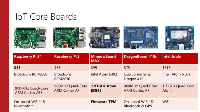
But with a low cost less than 40 euros or 35 dollars, we can create and deploy its own applications of embedded systems.
Here is a comparison chart of different motherboards supporting IoT :
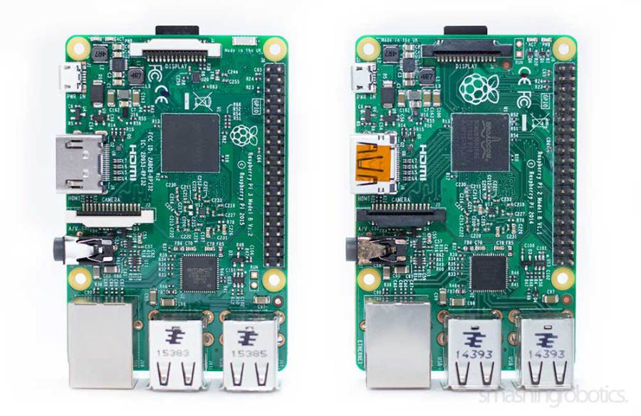
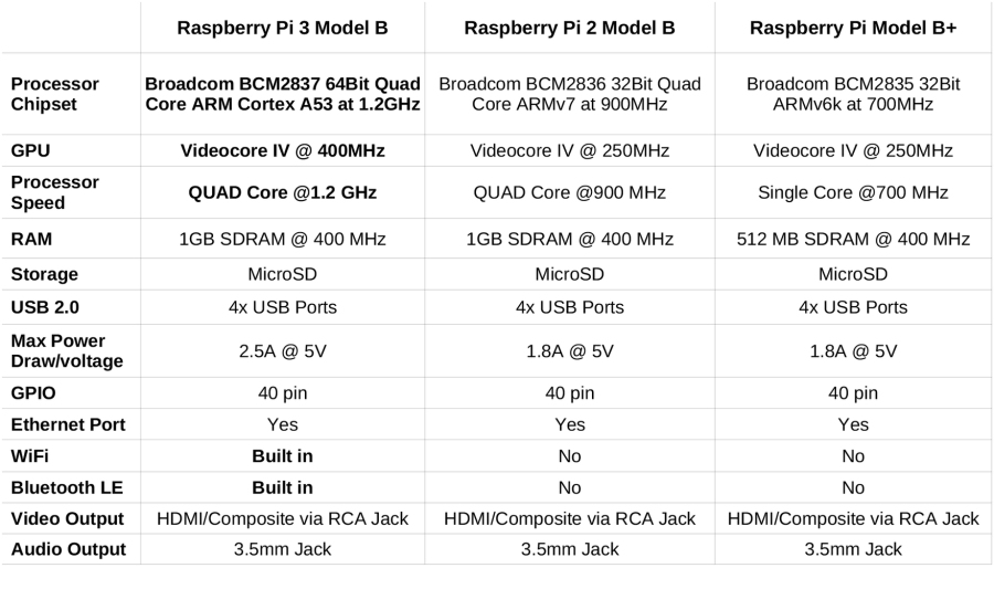
Difference between Raspberry Pi 2 and the model Pi 3
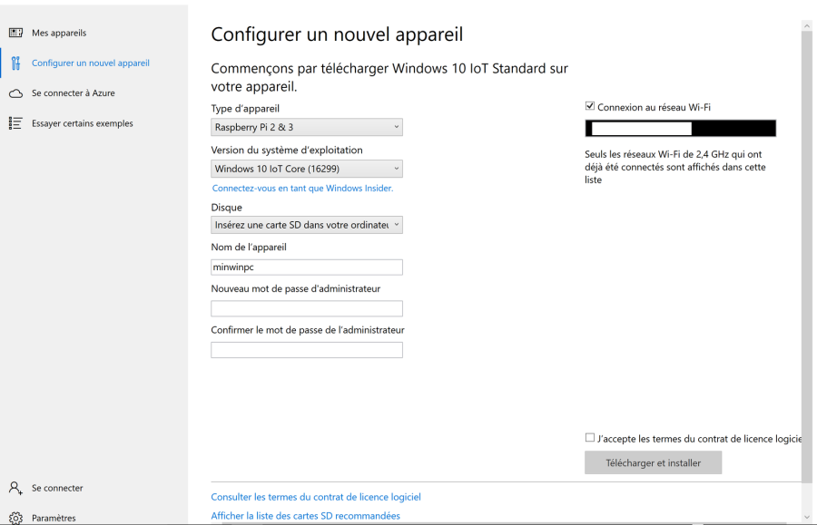
There you will eventually install Windows 10 IoT Core for Raspberry Pi 2 & 3 in your SD Card and Windows IoT Core Dashboard
on your computer.
If you use another motherboard model such as Dragonboard 410C or MinnowBoard MAX, you need to download the specific ISO file.
Note that the Dragonboard motherboard are widely used on many brands of smartphones, the turn is better for Qualcomm than for Intel,
that's why there is currently no Intel card supporting Windows IoT Core.
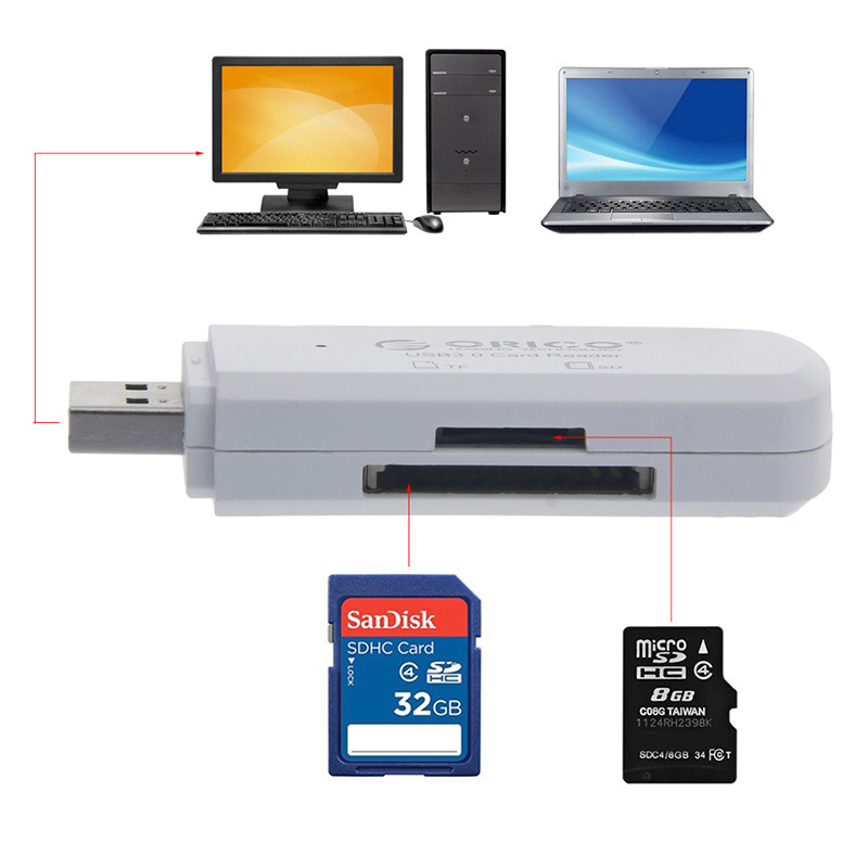
You must then use an 8 GB SD card to insert the appropriate ISO file.
Think of formatting the SD card before with a utility like Win32DiskImager,
there is also other software to format memory cards.
Then use Windows IoT Core Dashboard to install the ISO file your micro motherboard:
this file will contain the image of your mini Windows IoT Core system. Respect
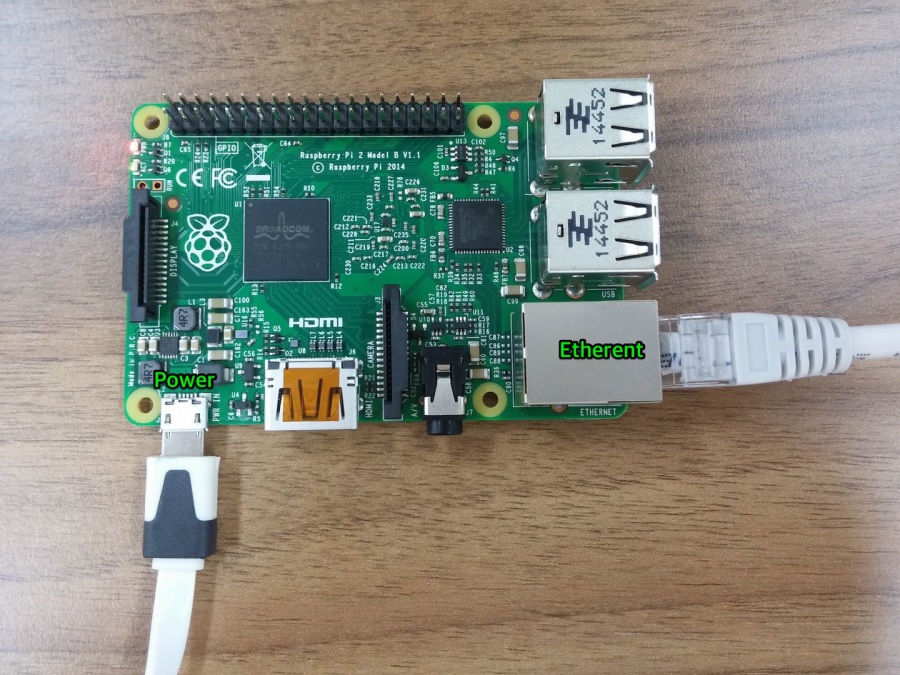
the Ethernet connection from your PC, your Raspberry or Qualcomm DragonBoard will be recognized
from an IP address so from an Ethernet connection.

During this step you must have plugged a micro SD card from a USB connection to your PC.
Once the micro SD card insert into a compatible slot, you need to install your operating system
Windows IoT Core including all system files required to install Windows IoT on your Raspberry PI.
Once installed on the memory card, you need to insert the card into the SD card slot of the micro motherboard.
Remember to connect your micro card with an Ethernet cable from the port of your device and connect it to your computer.
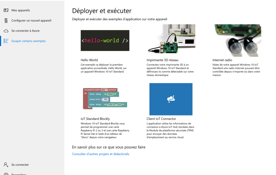
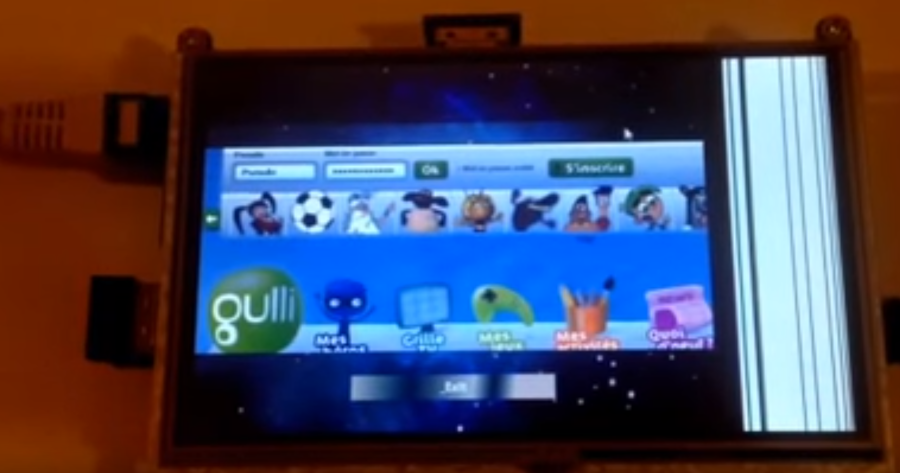
You are the possibility to download in install
sample IoT project in your Raspberry PI like web radio or
3D network printer.
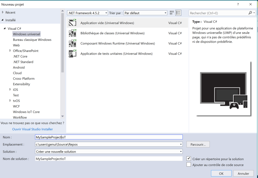
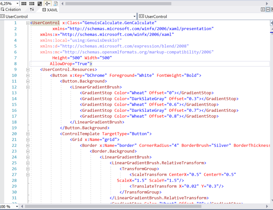
Create an UWP Project with Visual Studio 2017 version 15.3.5
To start thinking about creating a UWP project, an empty project will suffice.
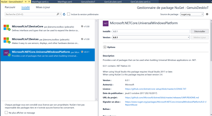
Once the UWP project is created, think about adding a Microsoft.NETCore.UniversalWindowsPlateform NuGet package to the solution.
Microsoft.IoT.DeviceCore and Microsoft.IoT.Devices are optional.
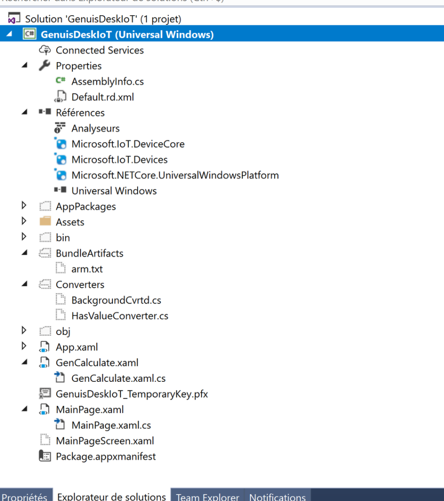
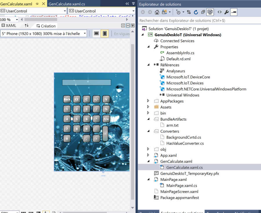
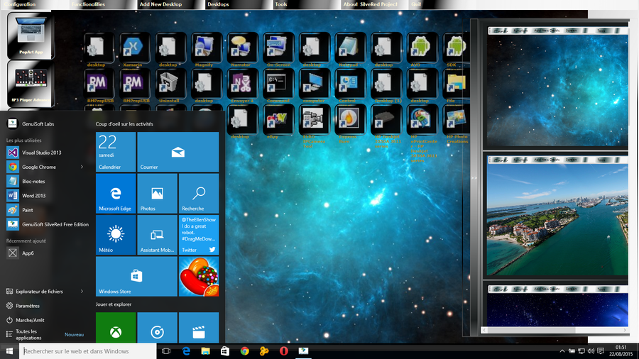
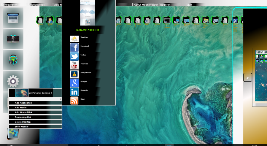
Here is the structure of the Visual Studio solution of a UWP project for Windows IoT Core.
using System;
using Windows.UI.Xaml;
using Windows.UI.Xaml.Controls;
Sample event of Pointer of Touch screen PointerEntered event
#region Button multiple click event
/// Button multiple click event // private void BtnMulti_Click(object sender, Windows.UI.Xaml.Input.PointerRoutedEventArgs e)
{
TapeChar.Add('*'); Compute(); TextBoxValeur.Text = ResultCalculate.ToString();
}
#endregion
A sample with a WebView component : possibility to view YouTube channels with a Wifi Internet connection
Little project of sample UWP for IoT Core available on
https://www.genuisoft.com/open-source/
Reference site on IoT:
https://www.raspberrypi.org/
https://developer.microsoft.com/fr-fr/windows/iot
https://www.arduino.cc/en/ArduinoCertified/IntelGalileo
Remarks : Very interesting peripheral devices and tutorials are available the AdaFruit
website builder to create and assemble its own projects with touch screens,
radio antenna and many other components.
Visit my Portfolio Website : www.genuisoft.com
Daniel Padrosa
Software Engineer senior
Microsoft Certified Professional
Microsoft Professional Associate
Microsoft Certified Technology Specialist
Microsoft Certified Professional Developer
How to develop Windows Store App
This page aims to make you learn how to develop applications for the Windows Store App
Requirements : - Knowledge in C#
- Knowledge in XAML
- Need Visual Studio 2013
Commentaires
The source code is available on a media player application in XAML / C # to create a Windows Store App .
AppVideoSampleStore.zip
Fichier compressé au format ZIP [264.0 KB]
<Page
    x:Class="AppVideoSampleStore.MainPage"
    xmlns="http://schemas.microsoft.com/winfx/2006/xaml/presentation"
    xmlns:x="http://schemas.microsoft.com/winfx/2006/xaml"
    xmlns:d="http://schemas.microsoft.com/expression/blend/2008"
    xmlns:mc="http://schemas.openxmlformats.org/markup-compatibility/2006"
    mc:Ignorable="d">
<Grid Background="{ThemeResource ApplicationPageBackgroundThemeBrush}">
<Grid.RowDefinitions>
<RowDefinition Height="30"></RowDefinition>
<RowDefinition Height="Auto"></RowDefinition>
</Grid.RowDefinitions>
<Grid Grid.Row="0" Width="Auto" Margin="10" DataContext="{Binding .}">
<Grid.RowDefinitions>
<RowDefinition Height="Auto"></RowDefinition>
</Grid.RowDefinitions>
<Grid.ColumnDefinitions>
<ColumnDefinition Width="30"></ColumnDefinition>
<ColumnDefinition Width="*"></ColumnDefinition>
<ColumnDefinition Width="50"></ColumnDefinition>
<ColumnDefinition Width="30"></ColumnDefinition>
</Grid.ColumnDefinitions>
<Button x:Name="MusicPlayerAdd" ClickMode="Press" Grid.Column="4">
<Button.Content>
<Border Width="35" CornerRadius="10">
<TextBlock Text="+">
</TextBlock>
</Border>
</Button.Content>
</Button>
<ComboBox Grid.Column="2" Grid.Row="0"
ItemsSource="{Binding PanelColors,Mode=OneWay}">
<ComboBox.ItemsPanel>
<ItemsPanelTemplate>
<StackPanel Orientation="Vertical"
DataContext="{Binding .}"/>
</ItemsPanelTemplate>
</ComboBox.ItemsPanel>
<ComboBox.ItemTemplate>
<DataTemplate>
<StackPanel Orientation="Horizontal">
<TextBlock Text="{Binding
Name,Mode=OneWay}">
</TextBlock>
<Button
HorizontalAlignment="Right"
VerticalAlignment="Center"
Background="{Binding Color,Mode=TwoWay}"/>
</StackPanel>
</DataTemplate>
</ComboBox.ItemTemplate>
</ComboBox>
</Grid>
<Grid x:Name="GridContentMp3Player" Height="Auto" Grid.Row="1">
<Grid.ColumnDefinitions>
<ColumnDefinition Width="20,*"/>
<ColumnDefinition Width="23,*"/>
<ColumnDefinition Width="271,*"/>
<ColumnDefinition Width="*"/>
</Grid.ColumnDefinitions>
<Grid.RowDefinitions>
<RowDefinition Height="170"></RowDefinition>
<RowDefinition Height="Auto"></RowDefinition>
</Grid.RowDefinitions>
<Grid Grid.Row="0" Grid.ColumnSpan="10">
<Grid.ColumnDefinitions>
<ColumnDefinition Width="170"></ColumnDefinition>
<ColumnDefinition Width="170"></ColumnDefinition>
<ColumnDefinition Width="170"></ColumnDefinition>
<ColumnDefinition Width="170"></ColumnDefinition>
<ColumnDefinition Width="170"></ColumnDefinition>
<ColumnDefinition Width="170"></ColumnDefinition>
<ColumnDefinition Width="170"></ColumnDefinition>
<ColumnDefinition Width="*"></ColumnDefinition>
</Grid.ColumnDefinitions>
<Button Grid.Column="0"
Name="buttonPlayMedia" Content="Play"
Click="buttonPlayMedia_Click"
Height="40" HorizontalAlignment="Center"
VerticalAlignment="Top" Width="160"
Foreground="WhiteSmoke">
</Button>
<Button HorizontalAlignment="Center"
Grid.Column="1" Name="buttonPauseMedia"
Width="160" Height="40"
VerticalAlignment="Top"
Content="Pause"
Click="buttonPauseMedia_Click"
Foreground="WhiteSmoke">
</Button>
<Button Grid.Column="2" Width="160"
Name="buttonStopMedia"
Height="40" VerticalAlignment="Top"
Content="Stop" Click="buttonStopMedia_Click"
Foreground="WhiteSmoke"
HorizontalAlignment="Center">
</Button>
<Button Name="btnReverse"
Grid.Column="3"
VerticalAlignment="Top"
Content="Rewind" Foreground="WhiteSmoke"
Click="btnReverse_Click"
HorizontalAlignment="Center">
</Button>
<Button Name="btnForward" Grid.Column="4"
Click="btnForward_Click"
HorizontalAlignment="Center"
Width="160" Height="40"
VerticalAlignment="Top" Content="Forward">
</Button>
<Button Height="40" HorizontalAlignment="Center"
Visibility="Collapsed" Grid.Column="5"
Name="buttonSpeedRatio"
VerticalAlignment="Top" Width="200"
Content="Loop" Click="buttonSpeedRatio_Click"
Foreground="WhiteSmoke">
</Button>
<Button Height="40" HorizontalAlignment="Center"
Name="buttonOpenMedia"
VerticalAlignment="Top" Width="160"
Content="Open" Click="buttonOpenMedia_Click"
Grid.Column="5" Foreground="WhiteSmoke">
</Button>
</Grid>
<TextBox Height="23" Margin="14,90,25,0"
Name="textBoxNameMedia" IsReadOnly="True"
FontSize="14" VerticalAlignment="Top"
Grid.ColumnSpan="10" FontFamily="Segoe UI Semibold">
</TextBox>
<TextBlock HorizontalAlignment="Left"
VerticalAlignment="Center"
Name="labelTimeElapsed"
Width="438" FontWeight="ExtraBold"
Foreground="White" Height="23"
Grid.Column="2" Margin="417,62,0,65"/>
<StackPanel Grid.Row="1" Orientation="Vertical"
Grid.ColumnSpan="10" Margin="50" Background="Black">
<ContentPresenter x:Name="ContentPresenterAudio"
Visibility="Visible"
Content="{Binding Visualization.Content}"
Height="70" VerticalAlignment="Top"/>
<MediaElement x:Name="MediaElementPlayer"
AutoPlay="False"
Height="400" Width="800"
AreTransportControlsEnabled="True"></MediaElement>
</StackPanel>
<StackPanel Margin="25" Grid.ColumnSpan="10">
<Border Opacity="0.9" Margin="5,30,10,5" Height="50">
<StackPanel Orientation="Horizontal" Margin="0,-12,0,0">
<StackPanel Orientation="Horizontal"
VerticalAlignment="Center"
Height="52" Width="700"
Margin="0,0,0,1">
<TextBlock Text="Mute : "
Margin="0,0,0,22" Width="51"
VerticalAlignment="Center"/>
<CheckBox x:Name="checkBoxMute"
IsChecked="{Binding
ElementName=MediaElementPlayer,
Path=IsMuted, Mode=TwoWay}"
VerticalAlignment="Center"
Margin="0,5,0,30"/>
<TextBlock Text="AutoPlay :
"
VerticalAlignment="Center" Margin="0,0,0,22"/>
<CheckBox
x:Name="checkBoxAutoReverse"
VerticalAlignment="Center"
IsChecked="{Binding
ElementName=MediaElementPlayer,
Path=AutoPlay,Mode=TwoWay}"
Margin="0,5,0,30"/>
<TextBlock Text="Loop : "
VerticalAlignment="Center"
Margin="0,0,0,22"/>
<CheckBox
x:Name="checkBoxLoop"
VerticalAlignment="Center"
IsChecked="{Binding
ElementName=MediaElementPlayer,
Path=IsLooping,Mode=TwoWay}"
Margin="0,5,0,30"/>
<TextBlock Text="Full screen :
"
VerticalAlignment="Center" Margin="0,0,0,22"/>
<CheckBox
x:Name="checkBoxFullWindow"
VerticalAlignment="Center"
IsChecked="{Binding
ElementName=MediaElementPlayer,
Path=IsFullWindow, Mode=TwoWay}"
Margin="0,5,0,30"/>
<TextBlock Text="Balance :
"
VerticalAlignment="Center"/>
<Slider x:Name="ProgressBalance"
VerticalAlignment="Top"
ValueChanged="ProgressBalance_ValueChanged_1"
Orientation="Vertical" Height="30"
Minimum="-1" Maximum="1"/>
<TextBlock Text="Sound:"
Margin="10,0,0,22" Width="49"
VerticalAlignment="Center"/>
<Slider
x:Name="sliderVolume"
Minimum="0"
Maximum="1" StepFrequency="0.01"
VerticalAlignment="Center"
Value="{Binding
Path=Volume,
ElementName=MediaElementPlayer,
Mode=TwoWay}"
Orientation="Horizontal"
Margin="10,-2,5,14" Height="40" Width="100">
</Slider>
<TextBlock Text="- 100%"
FontSize="10"
Margin="-20,25,0,0"></TextBlock>
<TextBlock Text="- 0%"
FontSize="10"/>
</StackPanel>
</StackPanel>
</Border>
</StackPanel>
</Grid>
</Grid>
</Page>


Genuisoft © Trademark


 Version imprimable
Plan du site
Version imprimable
Plan du site
Microsoft Certified Professional | PRO Development | Recognize Trademark © Genuisoft © Trademark 2014 - 2024